
CV format and design - the ultimate guide for 2026
There are two elements to a CV – the content and the visual presentation. This in-depth guide to CV format and design covers everything you could possibly need to know about creating a professional, well-laid-out CV, from structure and colour to fonts and bullets.
If you're just here for the headlines, all you need to know is that the best CV format is often the most boring – single column, standard font, no graphics. If you want the hows and whys, settle in as we dive into CV design in depth.
CV design basics
Let's start with the basics of CV formatting. The ultimate objective of your CV is to ensure a recruiter or hiring manager can find the information they want to see as quickly and easily as possible. The average time spent on the first scan of a CV is just a few seconds, so design decisions must be taken with the aim of either extending that time or immediately passing to the interview stage.
Visual hierarchy
The golden rule for CVs is to keep your most impressive and relevant information in the top half of the first page. If the reader scans that, and doesn't see what they're looking for, your CV will hit the bin straight away.
With that in mind, it helps to spend a few moments identifying what your main selling points are, in relation to the role you're applying for, and ensuring those points are reflected in your headline and profile.
This is also the reason that the most common CV format uses reverse-chronological order. Recent experience and qualifications are likely to be more relevant to your next steps than whatever you were doing 20 years ago, so the reverse-chronological format ensures the most important information is placed higher up the page and is seen faster.
White space and readability of the CV
Visual appeal is also developed by using white space generously. It can be tempting to cram as much information as possible into your CV, to ensure that the recruiter knows everything about you. That's not the way forward – it pays to be selective.
Leaving plenty of white space might mean using fewer words and saying less, but it makes it much easier for the reader to pick out key details and to focus on the words that really matter. It may mean careful writing and stripping out things you’d like to include, but remember the CV is only part of your application and you can expand on key facts in an interview.
To increase the amount of white space on your CV, use generous margins, increase the space between lines, use bullets rather than dense paragraphs, choose an unfussy font, and add extra space before and after headings.
That leads us to the length of your CV. Just because you've added plenty of white space doesn't mean you can stretch your CV to more pages. Aim for two wherever possible, give or take one either way!
Colour on a CV
There's no reason you shouldn't use colour on your CV and, done well, it can be a good way of making your CV stand out from the crowd.
That said, there’s a right way and a wrong way to add colour. Remember, you want to come across as a serious professional, not as a kid who’s just discovered all the formatting options in Word. To make sure you’re standing out for the right reasons, follow these tips:
- Try to stick to two colours, with one of them being black
- Use colour to highlight, not distract – the content should speak for itself
- Make sure that the colour doesn’t detract from the readability – avoid yellow on white, as a worst-case example
- Add colour to headings, rather than other text
Using colour as part of your CV format won’t have any effect on its ability to be read by an ATS – human readers should be your priority when considering what your CV looks like.
Expert tip: Word Dragon often uses a dark grey font – it's different, but professional rather than wacky.
CV font
A standard, black, sans-serif font in size 10-14 is recommended, with a larger font for headings. Word has a variety of formatting options you can use to make your CV format more unique to you, which can be used with a few caveats:
- Bold and italic: These options can be used throughout the CV, but remember their aim is to emphasise. Overusing them will make the CV very difficult to read, so take a considered approach.
- Underline: Underlined text is generally associated with hyperlinks these days so should be avoided, apart from genuine hyperlinks to your email address, LinkedIn profile or portfolio. Hyperlinks elsewhere should be avoided, as they will divert the recruiter's attention from your CV and are unlikely to be followed anyway in the early stages of a recruitment process.
- Highlight: Highlighting text should be avoided as it can look unprofessional or unfinished. Use bold or italic text to draw attention instead.
Expert tip: Word Dragon usually writes in 11pt Calibri, with 18pt for headers.
Text justification
Justifying text on a CV is a personal choice. Full justification (where the text forms a straight line down both sides of the page) looks smart and professional. Left justification, on the other hand (where only the left side is straight) is more accessible, especially for those with dyslexia. There's no right or wrong here, as long as you don't choose right-hand justification!
How to lay out a CV
Perhaps the most immediately striking part of the document, when it is first opened, is the overall CV layout.
Columns
As a rule, columns aren't advised on a CV. They can look great, but there are two problems. Firstly, it means information is split across two parts of the CV so recruiters have to work harder to find what they're looking for. Secondly, although there are many different ATSs on the market, many of them will not parse a CV with columns with complete accuracy.
On the whole, single column CVs tend to perform better and look more professional.
Headings
Headings are an important part of your CV format, as they enable the recruiter to navigate easily to the information they need and ensure what you're providing is well structured.
The key headings for a CV are:
- Name (with contact details)
- Profile
- Skills
- Experience
- Qualifications
- Additional details
Ensure your headings stand out from the rest of the text – consider using a larger font, bold text, underline or other point of differentiation.
Text format
Now the headings are in place, the rest of the text needs to look good within each section.
The profile is generally written as a short paragraph (no more than five lines). The remit of your role, within the experience section, can also be a few short sentences (again no more than four or five lines). Bullet pointing your achievements, below each paragraph, will help your successes and selling points to stand out on the page.
However you choose to present your career, avoid solid walls of text, as they can be off-putting to wade through.
Skills and qualifications should never be presented in full sentences. Skills can be listed as easily scannable keywords, whereas qualifications only require a brief list of the key details.
Technical considerations for your CV
With the on-page CV format coming together, it's time to consider the off-page format.
CV file format
A CV format question that comes up a lot is about the file itself. CVs are generally accepted in Microsoft Word or PDF files – I’d advise sending a Word file unless otherwise directed, as they tend to be read more accurately by applicant tracking systems.
Additionally, recruiters may prefer Word files so that they can edit them to support name-blind recruitment. I’ve never yet heard of a company specifically asking for CVs in Google Docs format, but I imagine it’s not far off.
Whichever way you choose to save your document, remember that the best CV format is exactly what’s requested on the job posting.
CV file name
Imagine you're a recruiter. Your job, every day, is evaluating CVs for the various positions you're trying to fill. Now imagine how many of those documents are saved as "CV" or "my CV". It's not very helpful.
Choose a file name that is easily identifiable as your CV, for example:
- John Smith – CV – Sales Manager
- Anne Gables – Admin CV 2026
- M Khan CV for DevOps Role at Acme Corp
What other CV formats are there?
If you don't like the traditional CV format, video CVs and websites are becoming more popular. A note of caution though – these types of application are still likely to require a traditional accompanying CV for a while yet. Not least because they're not as easy to take into an interview!
A good alternative is to set up a comprehensive LinkedIn profile.
Should I use an internet CV template?
There are some eye-catching and unique templates available for free on the internet, which will certainly help your CV to stand out. There can be problems with using them, though.
- The most popular ones are used by so many people that, although you think you’ve got an original, stand-out CV, there are thousands of other people using the same template and thinking the same thing. Canva and Microsoft Word, I'm looking at you!
- They tend to be a one-size-fits-all approach. If you want to emphasise one section over another, add a new section or expand something, the format of the whole CV is thrown out and your document ends up looking disjointed, amateur and unfinished.
- The vast majority of templates are created by designers, rather than by someone with an understanding of recruitment and ATS. While your CV may look spectacular to you, the ATS parsing may render it unreadable and your hard work will be for nothing.
Word Dragon, a certified UK CV writing service with over 15 years' experience, has prepared a free CV template, which is a cost-effective alternative to a professionally written CV. Why not download the accompanying eBook to ensure you're using best practice when you fill it in?
Common CV design mistakes
With a professional CV format coming together nicely, it's time to make sure you're not making any of these CV mistakes.
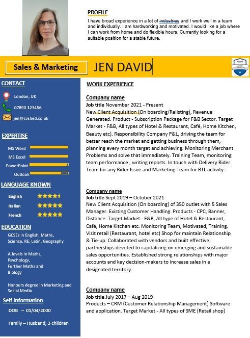
Graphics, icons and logos
Using graphics on a CV is one of the most common mistakes. This includes photos, business logos, icons and skills graphs. None of these should be on your CV for several reasons.
- Firstly, it doesn’t look professional. Best practice for CVs is a text-only document.
- Secondly, photos shouldn't be included due to anti-discrimination legislation.
- Thirdly, the CV should be selling you personally, not the businesses whose logos you've added.
- Fourthly, skills graphs are meaningless, as you're not evaluating your skills against a common framework for all candidates, you're just showing your own opinion.
- Fifthly, ATS can't accurately read these design elements, meaning your CV is unlikely to be interpreted as you expect. The best case is that you end up needing to type all the information into the application portal again, even though you've already uploaded your CV. The worst case is that the human on the other end can't read it properly.
Tables and text boxes
Tables and text boxes should be avoided for the same reasons – not all ATSs parse them accurately. There are many systems available and they all work in different ways, and no doubt some can read them perfectly well. But it's better to be safe than sorry – there's really no need for them on a well-designed CV.
Over-designed CVs
To get through the CV sift and onto the next stage of the recruitment process, content is king. All the fancy CV formatting in the world won't fix bad content and is at best a distraction. Remember that the aim of your CV is to land an interview, which won't be achieved if it's read by a frustrated recruiter not being able to locate the details they need to make a decision. You'll be remembered for all the wrong reasons.
Inconsistency
A consistent CV not only looks smart, it speaks to your professionalism and attention to detail. Ensure all headings are in the same font, at the same size. If you use bullets for one job, use them for the others, too. If you have a full-stop at the end of one bullet, either remove it or put full-stops on the other bullets too. It's the small things that add up to make that all-important first impression.
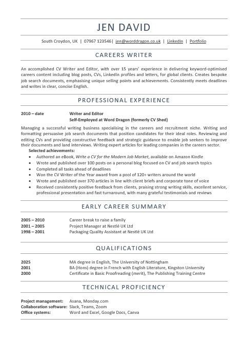
CV format examples
Take a look at these two CVs - a best practice CV created by Word Dragon and an anonymised CV circulating in the wild and decide for yourself which one looks more professional and easy to navigate.
When to break the CV formatting rules
Where there's a rule, there's an excuse to break it! While the CV format guidelines above will work for most people, some careers require something a bit different.
Creative CVs
Developing a CV for creative roles can be tricky. If you suspect your CV will be parsed by an ATS (most medium and large companies use them, as well as online job boards), then sticking to the guidelines above is advisable.
Understandably, that doesn't give you much scope to show off your creative skills, which are key to the role you're applying for. In that case, you can also design a creative CV, which can be handed over in the interview or attached to an email (alongside your standard CV, if you're not sure how it will be handled at the other end).
It's also possible to include a hyperlink to your digital portfolio of work on your CV, which goes some way to circumventing the problem.
Academic CVs
Academic CVs generally stick to the best practice CV formatting guidelines above, but can be much longer. Three or four pages isn’t unusual, especially if there's a long list of publications to include.
Medical CVs
Even longer than academic CVs are medical CVs. They need additional sections for professional registrations, research, publications, presentations, conferences, audits, teaching, management and more. The general guidelines above still apply in terms of what the CV should look like, it's only the length and section headings that differ.
Outside of these exceptions, there are few – if any – reasons to deviate from the CV format best practice guidelines outlined here.
CV format FAQs
How many words should a CV be?
The wordcount of your CV really depends on what you've done! A college leaver with minimal experience would have an ideal CV wordcount of 350-400 words, whereas a senior executive could extend as far as 1,000+.
What colours can I use on my CV?
A black font always looks smart and professional. A splash of a different colour is fine, but it's advisable to keep it to the headings. Red, pink and yellow rarely make the right impression, where as blue, grey or green can look elegant.
How can I keep my CV to two pages?
If your CV is too long, try changing the font and margins, and ruthlessly editing. Bullet points rather than paragraphs can force you to write more concisely.
CV format TL:DR
Don’t sweat too much about your CV format. Much like art, what one person loves, another will hate. The most professional, readable, and successful CV format is just a standard document. Very little needs to be done in terms of design. Bear in mind that readability is the primary consideration and everything else will fall into place.
Ready to write your CV?
We've cleared up what a CV should look like, but what about the actual wording? If you’re feeling overwhelmed by the prospect of writing your CV, or you’re not quite sure how to present your experience, Word Dragon can help! Please take a look at my CV services and get in touch!
Updated 2026

Author bio: Jen is a UK-based careers writer with over 15 years' experience in writing CVs for UK professionals. She is a certified member of the British Association of CV Writers, with a Master's degree in English, and has written and edited articles for international businesses.
Share this Blog
More from my Blog..