What is the best CV font?
Great presentation is key to a great CV. The first impression comes from the overall look of the document, before the reader even starts reading, so choosing the best CV font is an important decision. As a rule, pick a standard, sans-serif fonts, in size 10-14 and you won't go far wrong. Let's look at why, and examine other options.
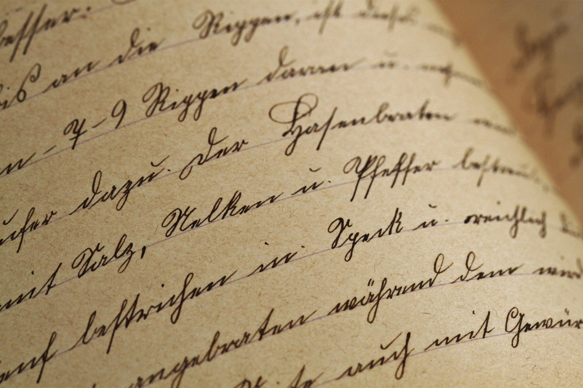
Choose a Sans Serif font
Serifs are the little flourishes on the top and bottom of letters.
This is a Serif font
This is a Sans Serif font
Serif fonts can look great when printed out, but most CVs these days are read on a screen initially. Therefore, choosing a Sans Serif font is a wise decision, as they tend to be cleaner and easier to read on a screen. They also look more modern.
Choose a widely available font
The best CV fonts are the most common ones. Don’t choose a special font that you’ve downloaded or one that isn’t widely available on popular software such as Microsoft Word. You may think it looks great on your screen, but who can tell what it looks like when a hiring manager opens your CV? If you choose a font that’s widely available, you can be sure that what the hiring manager sees is presented in the way you intended.
Choose a professional font
Remember that your CV is a professional document, so your choice of font should reflect that. Fonts such as Comic Sans have a (possibly unjustified) bad reputation, so unless you’re a teacher steer clear. Similarly with any fonts that have “character”. The focus should be on the words themselves, not the style they’re written in. Plain and simple is the way forward.
Popular font choices for CVs
Times New Roman used to be considered the best CV font, but it looks rather dated these days. It also has serifs, which we’ve already shown is a poor choice.
Common Sans Serif fonts that are popular for CVs include Arial, Calibri, Verdana, Aptos and Open Sans. They’re clean, crisp and easy to read, without distracting from the words themselves.
Choose a sensible CV font size
Now you have a good idea of the best CV font, it’s time to think about the size. While there are no hard and fast rules, there are a few guidelines to bear in mind.
Firstly, the headings should be in a larger font size to help them pop off the page and aid navigation around your CV.
Secondly, the main CV font size shouldn’t be so tiny that it’s difficult to read, or so huge that it looks like a child’s textbook. Do you remember when you had to write an essay at school and thought you were being smart by writing REALLY BIG so that the page got filled up sooner? Yeah, avoid that look.
Not every font is equally legible at the same size, but as a rule 10-14 point is good for the main body and 14-18 point is good for headings. Have a play around to see what looks great in the font you’ve chosen.
Choosing a font colour for your CV
You can’t go wrong with a black font. Bear in mind that the overall look you’re aiming for is professional and credible. That said, if you want to bring in a bit of colour, there’s no reason not to. Consider a different colour for the headings or use colour to highlight particular skills if you can do it neatly and consistently – but only take this route if you’re confident that the overall look will give your CV the gravitas it needs. There’s no obligation to include colour and a plain black and white CV is always a sensible choice.
Mixing and matching CV fonts
I’d advise keeping to one font throughout the CV – two at a maximum if you want something different for the headers. Navigating a mix of fonts gives a more chaotic impression and isn’t particularly easy on the eye. Unless you’re aiming for a creative role, the hiring manager will be evaluating the content over the design of your CV. By choosing inobtrusive fonts, you’re letting them focus on the wording – and that’s what will sell you into the role.
The best CV font - according to Word Dragon
Personally, I like to write CVs in 11-point Calibri with 16-point headers, in a very dark grey. It looks smart and professional and – critically – is easy to read. And the easier you can make the reader’s job, the more attention they’ll pay to your CV.
But remember, like every other aspect of design, what one person loves another will hate. The best CV font is as personal choice, so it’s really up to you which one you choose.
Checklist for choosing the best CV font
Choose the best CV font by selecting…
- A Sans Serif font
- A widely available font
- A font that’s easy to read
- A 10-14-point font, with larger headings
- A maximum of 2 colours
- A maximum of 2 different fonts
Above all, focus on readability over creativity.
Need more CV advice?
If you’ve got any more CV questions, Word Dragon can provide help whatever your budget. From free advice in the blog to a personal review of your CV to a full CV writing service, why not find out how I can help you?
Updated 2026

Author bio: Jen is a UK-based careers writer with over 15 years' experience in writing CVs for UK professionals. She is a certified member of the British Association of CV Writers, with a Master's degree in English, and has written and edited articles for international businesses.
Share this Blog
More from my Blog..