
What is the best CV layout? With example CV!
The best CV layout is clean, professional and structured. But when you’re writing a CV from scratch, it’s hard to know where to begin! As well as thinking about the wording you want to use, you also need to consider the best CV layout for your personal situation. If you haven’t updated your CV for a while, it’s worth getting yourself up to date with the latest expectations to ensure you’re giving your CV the WOW factor.
How should a CV be presented?
A CV should first and foremost look professional – you’re trying to impress a recruiter or hiring manager, not your mates. Graphics, logos and skills bars don’t go down well with UK recruiters, whereas a clean, linear format does.
Your main consideration should be your reader. Make their life as easy as you can. Remember that your CV is the first impression you will make on them, so if, at first glance, the layout appears sloppy then so will you. Your ability to demonstrate the right skills, experience, attitude and qualifications will carry far more weight with the reader than over-designed presentation.
Which is the best CV layout?
There’s no one “best” CV layout - it's a matter of taste, and what one recruiter loves another may hate. However, there are steps you can take to ensure that your CV is well designed. The main rules are to keep it:
- Easily readable - choose a font that is easy to read, both on screen and when printed out, in a sensible size
- Structured - ensure there's a logical flow through the document and that headers are easy to pick out
- Concise - cut out the waffle and use bullet points instead of long paragraphs
- Consistent - this is an easy way to show your attention to detail and eye for presentation
- Well-spaced - don't overwhelm the reader with a cramped layout, use white space to your advantage
- Clear - with headers signposting each section
You’ll need to include the following sections:
- Contact details
- Professional Profile
- Professional experience and achievements
- Qualifications and professional development
- Plus optional additional sections at the end, depending on your personal situation.
An example of one of the best CV layouts
If you’re looking for an example of a great CV layout – this is it! It’s my own CV, as due to client confidentiality I can’t share any others, but it lets us identify the key features that make a good CV.
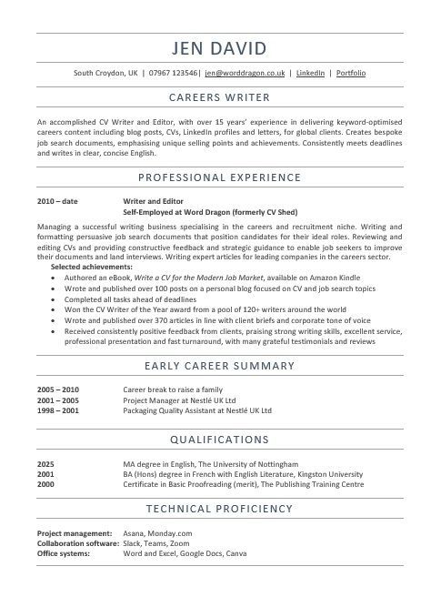
So, what makes this one of the best CV layouts?
- There’s a lot of white space, which makes it easy to read and digest
- The section headers are clear and consistent
- The font is Calibri 11 point – a standard, easily-readable font
- The contact details are easy to locate at the top
- It starts with a profile paragraph, that serves as both an introduction and elevator pitch
- The career history is concise and uses bullets
- Achievements are separated out from responsibilities, to draw attention to them
- The early career is summarised, as the detail isn’t recent or relevant
- Career and education details are presented in reverse-chronological order
- Formatting is consistent throughout the document
- There are no graphics, images, photos, logos or charts, to distract from the important content
- There is a logical flow through the document
An example of a bad CV layout
So now you know what the best CV layouts look like, what CV layout mistakes do you need to avoid? Here's an anonymised example based on a CV I received:
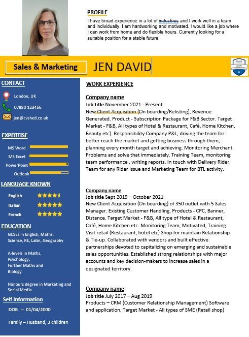
What makes this a bad CV layout?
- A photo is included - a bad idea that readers should ignore due to anti-discrimination legislation
- Garish colours detract from the content
- Skills bars, star ratings and logos - virtually meaningless and likely to cause parsing errors in an ATS
- Paragraphs that make a wall of text, instead of easy-to-read bullet points
- No clear achievements highlighted
- Education presented with oldest qualification first
- Irrelevant personal details taking up space
- Mistakes with spelling, punctuation, grammar and syntax
- No logical flow of sections
- Profile section that is generic at best and doesn't show how the candidate will add value
Should I use a layout from the internet?
Be very cautious about CV templates that you find online. While some of them look great, the majority of them don't meet best practice guidelines and hardly any are ATS compatible. Over-designed CVs are more style than substance - clean, single-column CVs tend to work best. Many also have a pre-determined space for each section, meaning that you can't fit your own details comfortably into the space allocated. You'll either have too much space, or not enough.
If you need a template, try the one at the end of this article - it has been designed by a certified CV writer with over 15 years' experience in producing CVs that land interviews.
Still unsure about the best CV layout?
As long as you focus on your reader, you’re free to express yourself and experiment within these guidelines until you have the best CV layout for you.
Alternatively, Word Dragon can help you to put your best foot forward. With services ranging from a full CV written from scratch to a job application toolkit, there's bound to be a service that meets your needs and your budget. Why not get in touch to see how I can help you?
Updated 2026

Author bio: Jen is a UK-based careers writer with over 15 years' experience in writing CVs for UK professionals. She is a certified member of the British Association of CV Writers, with a Master's degree in English, and has written and edited articles for international businesses.
Share this Blog
More from my Blog..